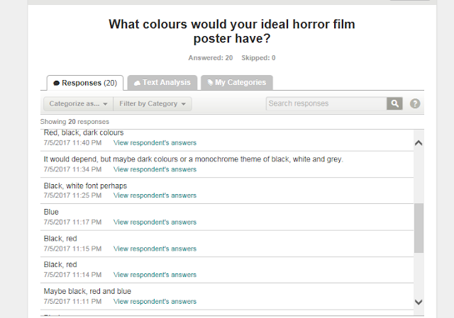
Our target audience identified the colours associated with horror to be mainly black. Thus, we should use black in our horror poster product as it a convention that identifies a poster as a horror movie. Some people said they like the ‘Scream’ poster or ‘The exorcist’ because it looks dark and mysterious. However others said that they don’t have a favourite film poster for horror because they don’t watch horror for several reasons. Our target audience starts from the age of 15, as it is a 15 age rated film. The participants who took on the survey were mostly aged 15 to 18. This shows a younger audience would have more time to watch films as adults stereotypically have work to be doing and are busy. Nevertheless, our target audience still includes these age groups. Because of the age group, it tells us that we should produce an appealing poste and not one with a dull picture that doesn’t attract our target audience. Our target audience said that the poster should not be more revealing than the radio trailer, and so we mustn’t give away as much information through the poster than through the radio trailer. This links to the net question. Our audience think there should be more pictures than writing in the poster.
How has their input helped us?
They have enabled us with the advantage of knowing what they would like to see in the poster and what they wouldn't like to see. For example, the majority of people had selected dark colours and to have the main character at the front of the poster. This will help us when we create our own horror movie poster because we will know that our audience wouldn't like bright colours such as yellow to identify it with the horror genre. The results of this survey also tells us that our target audience themselves know some codes and conventions of a horror movie poster as living in a postmodern world, posters are not only displayed on walls but can also be digitally shared, for example through Facebook and Instagram. This can help us in the future if we wanted to create a campaign for our products.


No comments:
Post a Comment