This meeting was held to clarify which messages Mila would be waking up to in the film. We decided it will be these messages (shown below). However, there may be the problem of glitching on the scream or fuzzy lines if we record the actual phone screen. In order to avoid this, we would have to enter text on the screen in post production whilst editing.
Wednesday, 27 December 2017
Tuesday, 26 December 2017
Sunday, 24 December 2017
Improvements from initial 'ABE' analysis under research.
Through the planning and production of my coursework, I have decided to add additional analysis to the short horror film 'ABE' which I had analysed at the beginning of my coursework under research.
Both are films also challenge Todorov's equilibrium theory as we start and end in a disequilibrium and there is never an equilibrium.
The short film follows many of it's genre's codes and conventions such as having low lit lighting, eerie music, death and blood.
 The film starts off with a continuing sound of something that sounds like a wheel / car travelling in an empty hall. This sound is echoed whilst the opening titles appear on the screen. The opening titles follow conventionally of most horror films as they are on a black screen and slowly fade the texts in and out. The production company is shown at first, followed by the director and title of the film. How this can apply to my product is that we can start our horror film with a fade in from black and ambient sound of the atmosphere Mila (our main character) is in. For example, it would be a flashback of Mila stabbing one of her bullies, then it could fade into black and say 'A Dark Arts Production".
The opening titles in 'ABE' followed the 3 words per second rule as there were enough words to read in teh space of 3 seconds. The texts of the titles followed after each other after 3 seconds of display.
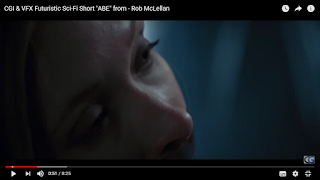 The eerie sound of the echoing builds up to a climax and sounds orchestrated. As the handheld shot of the footage of the blooded chains cut from one moving image to another, there are other instruments that enter the scene. For example, at 0.42 seconds, it sounds like an instrument similar to chimes. There are continuous cuts from the chain scenes which we used similar editing techniques in our production too. For example, the daily routine of Mila getting ready in the morning was full of continuous cuts and jump cuts show show that mentally, she is not steady and to connote that she is not a normal person. After the chime type of sound in ABE, it is then followed by the flutter of the moth as soon as the woman's eyes flutter open.
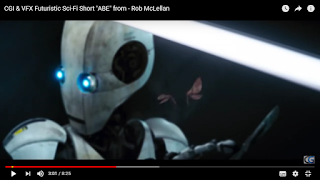 This links with the scene where there is a high angle shot of the moth being sliced by the robot, it connotes that he will do this to the woman he has kidnapped. Additionally the sound links to the scene when he says human desires can all end in the "blink of an eye", with the diegetic sound of a slice in the air as he cut the butterfly without looking. This foreshadows the woman's death as she is being represented like a beautiful butterfly. There is also intertextuality in this scene as this may represent the same as 'The Silence of the Lambs', another horror movie but on a larger scale in all costs, timing and production.
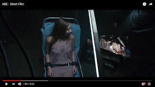 Going back to when the woman wakes up, she sees that her mouth is taped and her arms and legs are strapped down to operation type of bed. She tries to scream but the scream is muffled. This is similar to our production as we have a scene of one of the bullies on an operating bed with tape on her mouth, and she cries, tries to scream and struggles. The wide and long shots used in ABE to show the angles of the woman trapped are similar to our use of camera work as we have had close up's of the bully's face to show her struggle and the blood on her forehead is visible like the blood coming down the woman's nose in ABE. We also sued the idea of chains to chain the bully up so that she doesn't move instead of strapping her down to the bed like the woman is in ABE. Here we have applied a convention as there are usually the props of chains in horror movies. For example in 'ABE', and in the movie 'SAW' which is visible when the main character is chained in a room with three other people and has to cut his leg free from the chain.

Although, in the shots in ABE the woman's hair was straight and neat but in our film we wanted to adjust her hairstyle and make is messy as we wanted to show that she had been kidnapped and stabbed / operated in the stomach. We used a white sheet to put on top of the 'stab wound' in which the blood leaked through to create realism.
 The film starts off with a continuing sound of something that sounds like a wheel / car travelling in an empty hall. This sound is echoed whilst the opening titles appear on the screen. The opening titles follow conventionally of most horror films as they are on a black screen and slowly fade the texts in and out. The production company is shown at first, followed by the director and title of the film. How this can apply to my product is that we can start our horror film with a fade in from black and ambient sound of the atmosphere Mila (our main character) is in. For example, it would be a flashback of Mila stabbing one of her bullies, then it could fade into black and say 'A Dark Arts Production".
The opening titles in 'ABE' followed the 3 words per second rule as there were enough words to read in teh space of 3 seconds. The texts of the titles followed after each other after 3 seconds of display.
 The eerie sound of the echoing builds up to a climax and sounds orchestrated. As the handheld shot of the footage of the blooded chains cut from one moving image to another, there are other instruments that enter the scene. For example, at 0.42 seconds, it sounds like an instrument similar to chimes. There are continuous cuts from the chain scenes which we used similar editing techniques in our production too. For example, the daily routine of Mila getting ready in the morning was full of continuous cuts and jump cuts show show that mentally, she is not steady and to connote that she is not a normal person. After the chime type of sound in ABE, it is then followed by the flutter of the moth as soon as the woman's eyes flutter open.
  This links with the scene where there is a high angle shot of the moth being sliced by the robot, it connotes that he will do this to the woman he has kidnapped. Additionally the sound links to the scene when he says human desires can all end in the "blink of an eye", with the diegetic sound of a slice in the air as he cut the butterfly without looking. This foreshadows the woman's death as she is being represented like a beautiful butterfly. There is also intertextuality in this scene as this may represent the same as 'The Silence of the Lambs', another horror movie but on a larger scale in all costs, timing and production.
 Going back to when the woman wakes up, she sees that her mouth is taped and her arms and legs are strapped down to operation type of bed. She tries to scream but the scream is muffled. This is similar to our production as we have a scene of one of the bullies on an operating bed with tape on her mouth, and she cries, tries to scream and struggles. The wide and long shots used in ABE to show the angles of the woman trapped are similar to our use of camera work as we have had close up's of the bully's face to show her struggle and the blood on her forehead is visible like the blood coming down the woman's nose in ABE. We also sued the idea of chains to chain the bully up so that she doesn't move instead of strapping her down to the bed like the woman is in ABE. Here we have applied a convention as there are usually the props of chains in horror movies. For example in 'ABE', and in the movie 'SAW' which is visible when the main character is chained in a room with three other people and has to cut his leg free from the chain.
Although, in the shots in ABE the woman's hair was straight and neat but in our film we wanted to adjust her hairstyle and make is messy as we wanted to show that she had been kidnapped and stabbed / operated in the stomach. We used a white sheet to put on top of the 'stab wound' in which the blood leaked through to create realism.
There are clear narrative codes throughout 'ABE'. For example the clear binary opposites between human and robots. Normally, humans are the ones experimenting on robots but this film took a twist and made the robot end up experimenting on humans and their happiness. There are also binary opposites in my product as there are two identities of Mila, one good and one bad. Also, the victim of bullying is killing the bullies whereas in reality, the bullies would be hurting the victims. Although this is seen as a type of revenge in our narrative.
ABE, like ours has a non-linear narrative. This is because there are flashbacks included at the end of the film of the robot looking at the woman with ginger hair that he has fallen in love with. In our narrative, there it is non-linear as there are flashbacks of Mila stabbing her bullies, and they come in forms of nightmares in order to confuse the audience.
I believe both ABE and our film SENSELESS aim to confuse our target audience, as in ABE we do not know if the ginger haired woman is his next victim or previous victim, and in our film, we do not know if they are flashbacks or actual nightmares, but this is clarified at the end as the audience realise that they were flashbacks from when the evil identity took over Mila's mind and body.
Both are films also challenge Todorov's equilibrium theory as we start and end in a disequilibrium and there is never an equilibrium.
Tuesday, 19 December 2017
Research: SCORE: A FILM MUSIC DOCUMENTARY (2017)
Director: Matt Schrader
Cast: Danny Elfman, Hans Zimmer, John Williams
Release year: 2017.
I came across this documentary about the significance of sound and music used in films which was released in 2017.
What I learned from the documentary:
-In the earlier days, when film was first invented, music was seen as something to cover up the noise of the projector.
-Orchestra music was used for 'King Kong' which was one of the major scores that made the film successful. The sound was what made the film scary.
-David Arnold - using a room for sounds and instruments. They use a solar roof to allow them to have a certain amount of sound that they want. They also have over 200 mics in this acoustic room so they can choose which sound of how close or far away they want the sound from the instrument.
-There are different jobs in the sound and music art of the film industry, such as composers. These are the people who are mainly close with the director, as they have to sit with the director, listen to the director and the director has to listen to what the composer makes, as it it has to get across something that is in one person's ind but not in the other's. The example they use in this documentary is that of telling someone to imagine a forest, but people have different types of forests in their heads and not just one specific one.
-Action movies have a lot more music than others.
-The sound and music added in horror movies creates a sense of seeing more violence and horror than what you actually saw.
-Hans Zimmer took strings from a cello and made it sound like a guitar. On 'The Dark Knight' he tried to have a 'constant pulse' going on throughout to make it exciting.
-People are are song artists can also try to do the job of composers for some directors.
-"All your other work on film can come to nothing if you don't get the music right" - James Cameron, a director (includes Titanic).
-Not all music is orchestrated - the sketching scene in titanic was made by just a piano to create the emotional effect.
How does this help me with my coursework?
This documentary was useful in realising how important music is in creating a film, as it can determine how your audience thinks and can change moods in different ways. For example if you intend to create a funny scene in a comedy film and do not use the right music, the audience may not find the joke funny. For our horror film, it is crucial to get right what sounds and music we want to flow with our narrative and what instruments we should use in order to create these sounds. We may also need to consider how to orchestrate it on a low budget since we are low-budget producers as students.
When recording sounds, we may need to record more than one time and use different mics to get the sound just how we want it, but we can also use different editing software in case they don't sound right so that we can match it up with our footage.
The trailer of the documentary is shown below.
Sunday, 17 December 2017
Update on props & filming
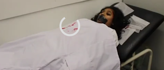
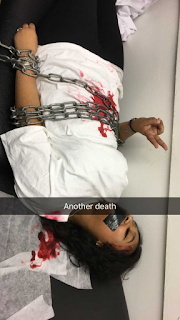 Instead of using ropes for our second flashback scene we used chains which we borrowed from the Art Department in our school. This relates to our horror genre more because it connotes that Mila has psychological problems to be changing a person up to a bed. It also shows that there is no way for bully2 to escape and foreshadows her death.
Friday, 15 December 2017
Group meeting 6
Whilst preparing for our second flashback scene, we decided to use ropes to tie down the bully to the bed. This would make it look more like a horror movie as she would be trapped and wouldn't be able to move. Preparing for our second flashback scene
 Preparing for our second flashback scene
 Thursday, 14 December 2017
Wednesday, 13 December 2017
Sourcing of Imagery
Sourcing of imagery from m_xch
Click the arrows pointing opposite ways on the bottom right to enlarge or click on "in" and then the arrows.
The initial idea of our poster was to show that there are two main characters and that they are the same person but with mental problems. We didn't want to reveal too much of the answers of the killer but we also wanted to portray the horror genre. The reason why we chose these photos is that it is of both the identities that our main character has, and the killer's face is shown at the end f the film but the audience do not know who the killer is until the end, and so we have kept this as an enigma code for our target audience.
The camera we used to take these photos was a Canon EOS 100D.
Trip to the Cinema to Watch the BBFC in Action
On the 11th of December 2017 we went on a trip to Genesis cinema to listen to the presentation from the BBFC and watch Justice League.
The BBFC presentation helped us to understand film classification better as we learned the differences between 15 rated, 12 rated and 12A rated films (show in in previous blog post under research).
How the BBFC presentation helped us determine the classification of our film:
There are scenes in our film which are rated an 18 simply because of the content shown, whereas the rest of the film can be rated a 15 like we had originally planned. For example, in our film we have a scene where the audience can see the knife being inserted into the body and out again - the whole process of the stabbing. This makes it an 18 rating as there is explicit violence.
How effective is the synergy between the poster, trailer and film for DC's 'Justice League'?
The poster is very colourful and optimistic. In this sense it's shown that nobody is left out and everyone can help to save the world which fits with their tagline, 'you can't save the world alone'. What also gets their target audience on the edge of their seats and full of anticipation is that the poster includes all the superhero's logos and signs, and in a clever way spells out the tagline with their symbols. This links with the trailer as all the heroes and main characters are shown in action at the beginning of the trailer. This grabs the audiences' attention and keeps them watching as fans would see their favourite heroes. The background in the poster matches with the beginning of the trailer after the industry and company logos are shown, where there is a pink sky and a big field. This connotes that the setting is somewhere that can be destroyed but then saved, and as it looks like a peaceful setting then this may be where the equilibrium is (Todorov). The trailer however doesn't go in the same sequence as the film which shows that Superman is alive at first (in the trailer) but in the film, he is already dead and then they find a way to bring him back alive. The movie shocks he audience as the trailer doesn't give away that Superman will come back alive and help the other superheroes to save the world.
In our product and ancillary products, we can do a similar thing by not revealing that our main character is the killer of her two bullies. In our poster we could show this by not not including the faces of our two bullies as this would give away that they were murdered by the main character, if she was there too. In the Justice League poster, they didn't include Superman and the shock of him returning in the film made it a success. In our poster, we could show our main character but not the others so that it creates an enigma code and makes our audience want to watch the movie to find out what happens in it.
In our radio trailer we could start off with the beginning of a newscast to make it seem realistic but not give away any names, again creating an enigma code.
Tuesday, 12 December 2017
Final Poster Layout
Last draft poster:
Good
|
Improve
|
The concept
|
|
The blue
hoodie being different from a conventional binary opposition of black and
white. The two hoodies show the contrast in characters.
|
|
The tagline
is catchy and the positioning of the title is good as it stands out
|
|
The
background relates to the genre and plot.IT helps to recognise it as a horror
genre.
|
|
We can see
the faces
|
|
Easy to
understand and it is clear.
|
Add a
background image related to the genre and the plot of the film.
|
Maybe insert
an image of a knife into the eye of the killer using PhotoShop.
|
THE FINAL POSTER CONSIDERING ALL FEEDBACK:
Monday, 11 December 2017
Draft Poster 2 & Feedback
What I changed about the poster based on the feedback from the 1st draft:
I added the age rating at the top right corner. I changed the font of the title and the tagline. I added out institutional information and logo. I tried to add a brick border.
Feedback for this draft:
I added the age rating at the top right corner. I changed the font of the title and the tagline. I added out institutional information and logo. I tried to add a brick border.
Feedback for this draft:
Good
|
Improve
|
The concept
and the binary oppositions
|
|
The two
identities represented as one person
|
Doesn’t tell
us who made the film
|
The tagline
is catchy
|
Doesn’t tell
us enough information of the film
|
Simple
|
No review
comments
|
We can see
the faces
|
The faces
should have a bit more emotion to it, maybe to show how the two identities
have opposing views and feelings.
|
Easy to
understand
|
Add a
background image related to the genre and the plot of the film.
|
Maybe insert
an image of a knife into the eye of the killer using PhotoShop.
|
Sunday, 10 December 2017
Draft poster 1 & Feedback
This is our first draft poster for our short horror film. I asked a few of my target audience what they thought of it and many people gave us a variety of feedback. This poster has a plain red background with two of the same people, one with a black hoodie and one with a white hoodie.
Good
|
Improve
|
The concept
and the binary oppositions
|
Show faces
|
The two
identities represented as one person
|
Doesn’t tell
us who made the film
|
The tagline
is catchy
|
Doesn’t tell
us enough information of the film
|
Simple
|
No review
comments
|
Simple font,
easy to understand
|
Add a
background image instead of plain red background
|
Saturday, 9 December 2017
Potential draft poster?
I tried to create a potential draft poster (without all the details such as the company name and logos, credits) using PicMonkey.com and using the photos I took at the photo shoot with our actress.
I merged three photos together to try and make it look like our protagonists life is going downhill. I used Snapchat to send a video of the poster and explain why I positioned the faces the way there were (so that it her mental state could be represented and so that it shows her mind is distorted). A couple of my target audience replied unexpectedly and gave me feedback on this potentially draft poster and they helped me recognise some faults in the poster and gave me advice on how to make it look more like a psychological horror movie poster.
The reason why this potential poster couldn't have worked is because we could have included one faded picture of her smiling in the background instead to show that she suffers from manic depression and DID. The font also does not suit our genre as it looks more technical or like a sci-fi movie font.
Friday, 8 December 2017
Thursday, 7 December 2017
Risk Assessments
Final risk assessment from m_xch
Press the enlarge icon to get a better view or click on the button next to it (in) to go to the page and zoom in
Press the enlarge icon to get a better view or click on the button next to it (in) to go to the page and zoom in
Wednesday, 6 December 2017
Tuesday, 5 December 2017
Monday, 4 December 2017
Animatic Storyboard
This is our animatic storyboard for out horror film. (Turn up the volume).
The process:
We divided the drawings into three parts: The beginning, middle and end. Mariam drew the beginning, I drew the middle and Noshin the end. As there is three of us in the group it was easier to divide and allocate parts.
We then took pictures of the drawings and used the Notes App to convert them into PDF files, then uploaded them to iMovie as we wanted to has an experience of how it would be if we were to edit real footage.
We want the audience to understand the significance the past has on Mila's (main character) Dissociative Identity Disorder (DID) and how it developed from being bullied so we included various shots of her taking anti depressant pills.
In the future we will use Final Cut Pro for our final product as it has more tools and effects, is well advanced from iMovie and I can develop my editing skills more.
Subscribe to:
Comments (Atom)


